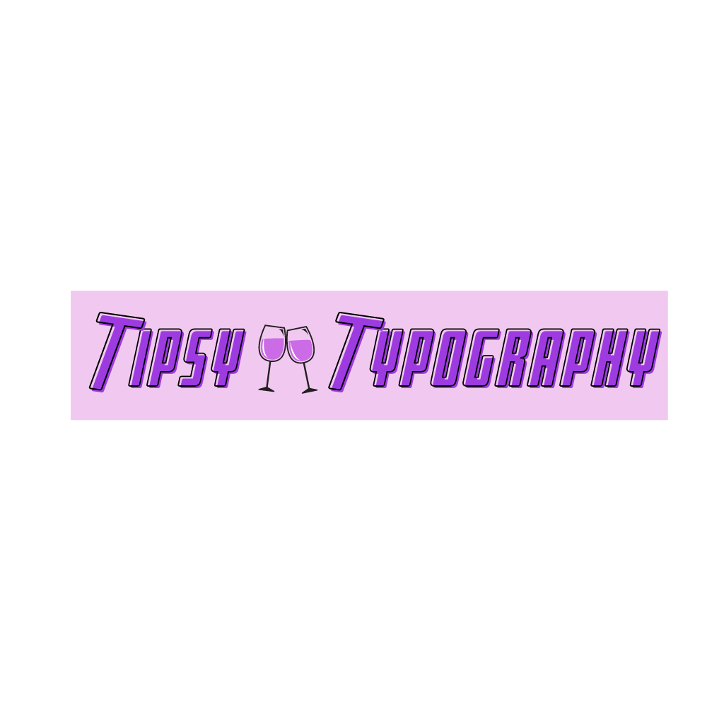
Tipsy Typography began with a day dream. Sat brainstorming ideas and looking around my university bedroom for inspiration, a couple of bottles of alcohol caught my eye. I was struck by the differences in typefaces used and how they differed depending on the type of alcohol they were and the branding as a whole. And just like that, with that ‘alcoholic’ student stereotype staring me in the face, Tipsy Typography was born.

The logo typeface needed to be bold and sans serif to not only represent the boldness of alcohol itself, but also to represent confidence that is often present in the target market of alcohol consumers once they’ve “had a few”. The word ‘tipsy’ went perfectly with ‘typography’ for a website on how different alcohols and alcohol brands used a variety of typefaces to represent their brands and target their preferred audiences.

I decided to angle the ‘T’s on both the logo and the banner at a 45 degree angle to represent how feeling ‘tipsy’ or drunk often makes people off balance in comparison to when they are sober. The purple of the type and in the banner image seems feminine but I feel it represents the theme of alcohol in an exciting way; we see something purple and are intrigued as to what it is about as it is not a typical colour used in branding. It also “combines the calm stability of blue and the fierce energy of red”, further representing the feelings that consuming alcohol can create.
I wanted to put a couple of wine glasses in the banner image to represent what the website was about but also to add more to the banner image as without the small wine glass image, it looks almost exactly the same as my logo.
Moreover, this website explores a variety of alcohols and how their typefaces differ to target their intended markets.
